


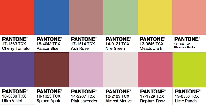
 Pantone colour trends of 2018 have arrived! If you are a wedding enthusiast like us this is your favourite announcement of the year, next to wedding dress trends of course. Well without further ado we have for you the Pantone colour trends of 2018.
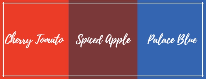
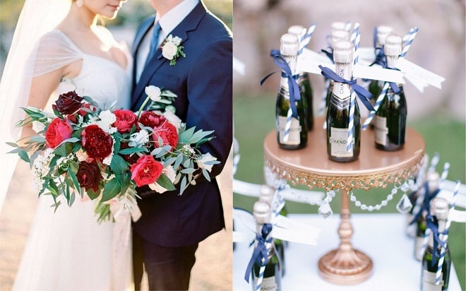 With winter weddings around the corner let us begin with Spiced Apple, Cherry Tomato, and Palace Blue. These colours work perfect together as rich blue tones and warm reds gives your wedding the well-deserved subtle glow. We have already seen palace blue as a popular colour for grooms’ suits but now we will be seeing more of it in the décor choices. As for the reds well these stunning options can be found in anything from flowers to bridesmaid dresses. All three of these tones will work well with different themes; Palace blue can be found in Nautica themed weddings and Cherry Tomato/Spiced Apple can be used in Hollywood themed weddings. If you’re not sold on using both reds, our recommendation is Spiced Apple as this is the perfect colour to incorporate in your bouquets and centrepieces. It matches especially well with Palace Blue as both of these colours will give your wedding a rich colour palette. Make that white wedding cake bold by adding a few Spiced Apple coloured flowers and watch your guests gaze at it with envy. Want to truly spice things up, your groom can wear a palace blue suit and bow tie and for yourself make a statement with a bold Spiced Apple lip colour.
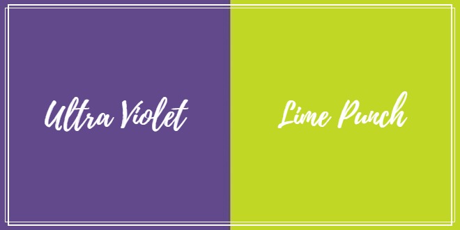 Jewel tones are all the rage this year with Ultra Violet. Yes purple has made a comeback in wedding trends. Wondering what the complimentary colours are to this stunner. For softer tones think Almost Mauve. You can be adventurous with Ultra Violet as a shoe colour, or the colour of your flowers. Almost Mauve can be an excellent colour choice for your floral, candle sticks even chair décor. Setting the stage for a country or garden themed wedding. For a bold statement combine Ultra Violet and Lime Punch. Ultra violet although a jewel tone, pairs beautifully with the neon tones of Lime Punch. Your wedding will pop with these two colours coexisting. Mix these colours in your bouquet or even the table setting of your reception.
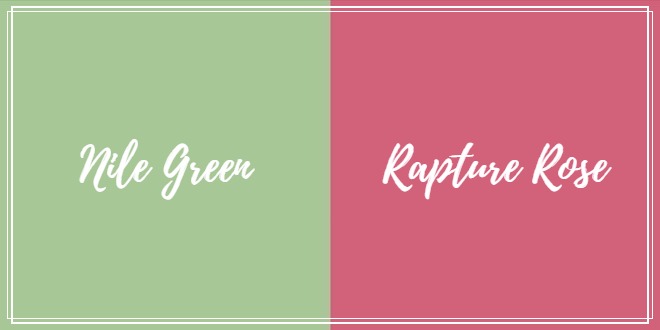
 Making a smooth transition out of the jewel tones and into the softer tones we start with Nile Green. A close cousin to forest tones this colour is perfectly paired with Rapture Rose. The darker green brings out the warm pink tones of rapture rose. Using these colours you will continue the ever popular garden theme. Add some colour to your cake, think Nile Green tiers with Rapture Rose coloured floral.
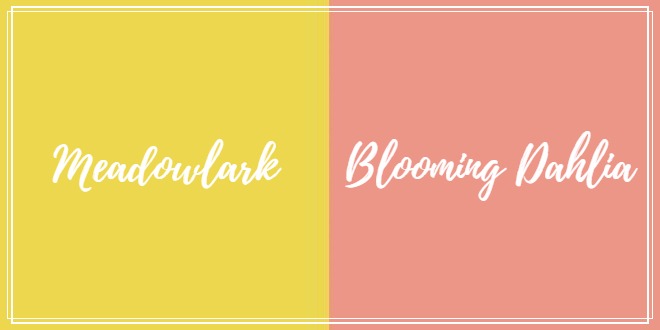 Transitioning from the neon greens to the yellows and oranges we have Meadowlark paired with Blooming Dahlia. These colours paired together are a pop of spring. Meadowlark is a mixture of an off gold and darker yellow tone, and is perfect for table settings or light yellow floral. Blooming Dahlia, is a light orange/coral colour, when used as candle sticks or place cards in reception table settings will give you the best of fall and spring.
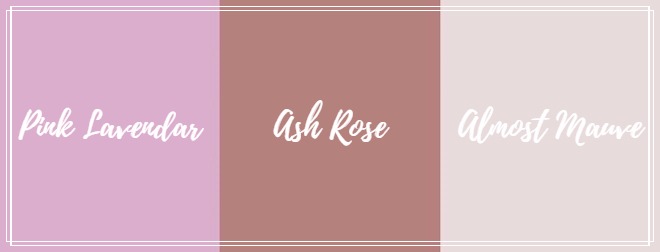 To finish off this wonderful pantone list we end with Ash Rose and Pink Lavender. Both colours are perfect for spring and summer weddings as they embody the best of a fairy-tale or whimsical wedding theme. Ash Rose is a darker blush colour that can be expressed through floral, shoes, bridesmaids’ dresses, really anywhere that you want to have dark blush included. Pink Lavender combines the beauty of both pink and light purple making this a hybrid colour. Both colours blend together nicely, making this the perfect colour combo.
There you have it the much anticipated 2018 pantone colour trends. Which do you think will be selected as the colour of the year?
Be the first to comment