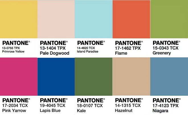
 As per their yearly tradition, Pantone has released their colour predictions for 2017. Last year’s predictions we saw a return to bright vibrant colours, but this year their selections include a much more muted and earthy palette. With so many gorgeous colours to choose from, we’re not sure how they’re going to choose just one as colour of the year.
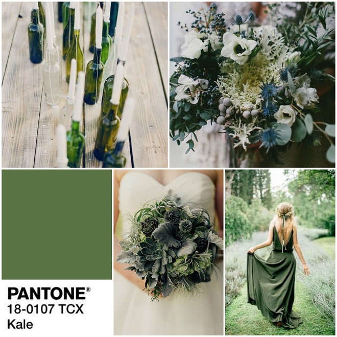 Kale – Evocative of the great outdoors and a healthy lifestyle, Kale is another foliage-based green that conjures up our desire to connect to nature.
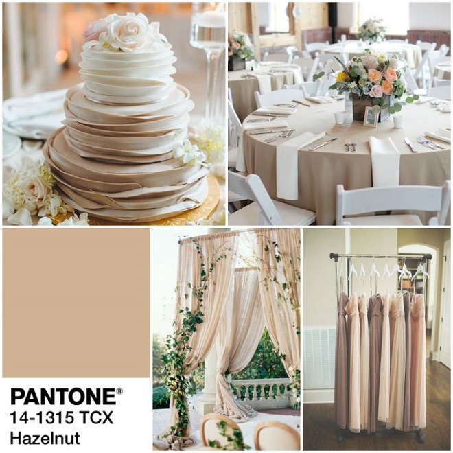 Hazelnut – This shade brings to mind a natural earthiness. Unpretentious and with an inherent warmth, Hazelnut is a transitional color that effortlessly connects the seasons.
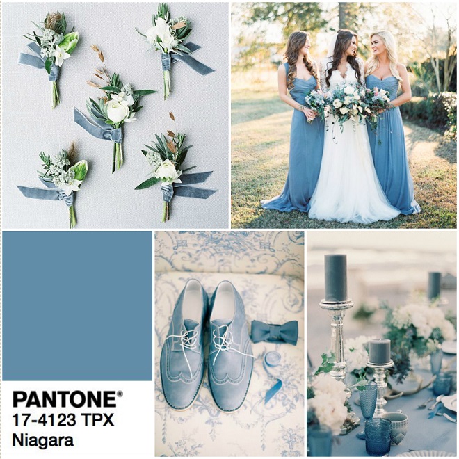 Niagara – Niagara is a classic denim-like blue that speaks to our desire for ease and relaxation.
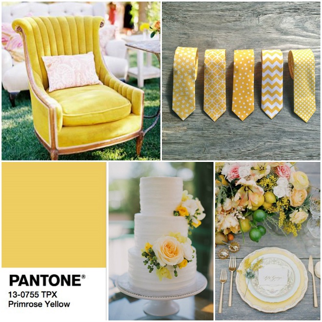 Primrose Yellow – Inviting us into its instant warmth, this joyful yellow shade takes us to a destination marked by enthusiasm, good cheer and sunny days.
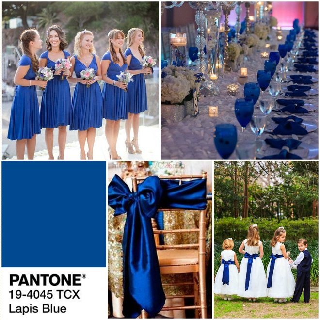 Lapis Blue – Strong and confident, this intense blue shade is imbued with an inner radiance.
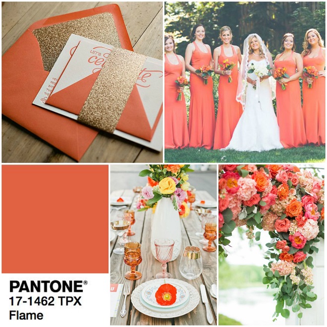 Flame – A red-based orange, Flame, is gregarious and fun loving. Flamboyant and vivacious, this wonderfully theatrical shade adds fiery heat.
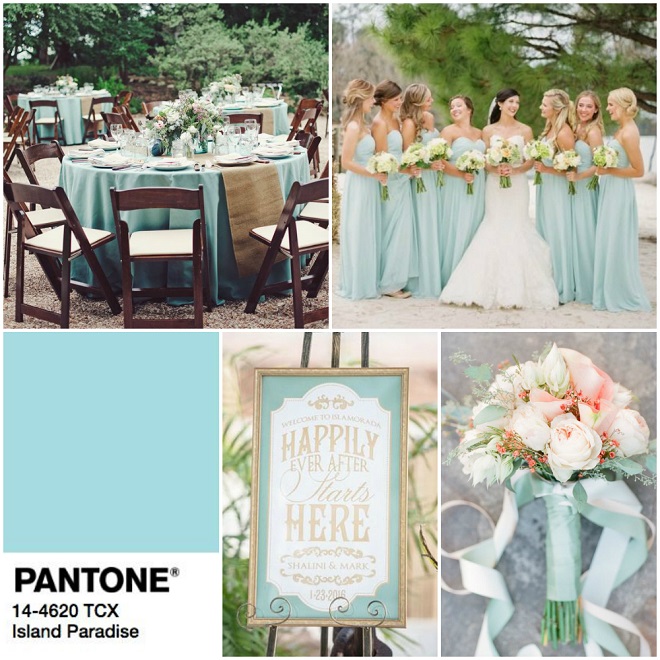 Island Paradise – A cool blue green shade that speaks to our dream of the great escape, Island Paradise is emblematic of tropical settings and our desire to unwind.
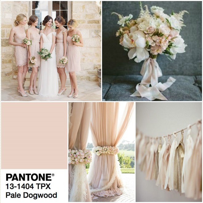 Pale Dogwood – A quiet and peaceful pink shade that engenders an aura of innocence and purity.
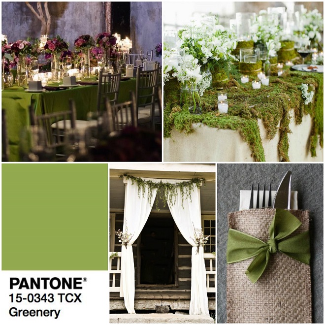 Greenery – A tangy yellow-green that speaks to our need to explore, experiment and reinvent. Illustrative of flourishing foliage, the fertile attributes of Greenery signals one to take a deep breath, oxygenate and reinvigorate.
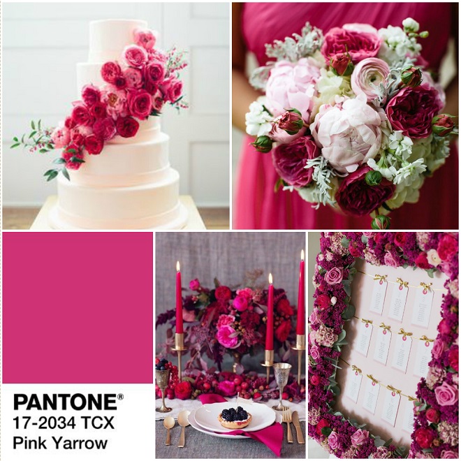 Pink Yarrow – Bold, attention getting and tempestuous, the lively Pink Yarrow is a captivating and stimulating color that lifts spirits and gets the adrenaline going.
What colour do you predict will win?
Source: www.patone.com
Be the first to comment